Choropleth Maps
Here we have some choropleth maps some interactive that show some trends in poliscidata, more speficly the trends in US abortion rate in 2008, and States support level for gay marriage also in 2008.
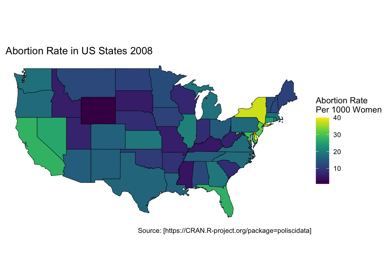
In this first plot we have a example of a static choropleth map, using abortion rate in the States.
While this is informative, we cant see the exact rate for each state, we can make a interactive leaflet plot to better show this trend.
Figure 2: Abortion trends in US states in 2008. It can be seen that states in the middle of the county have the lowest abortion rate while California, Nevada, Florida, and New York have the highest rate. Source: [https://CRAN.R-project.org/package=poliscidata]
Now we can look at a categorical variable, with a static plot with gay marige support.
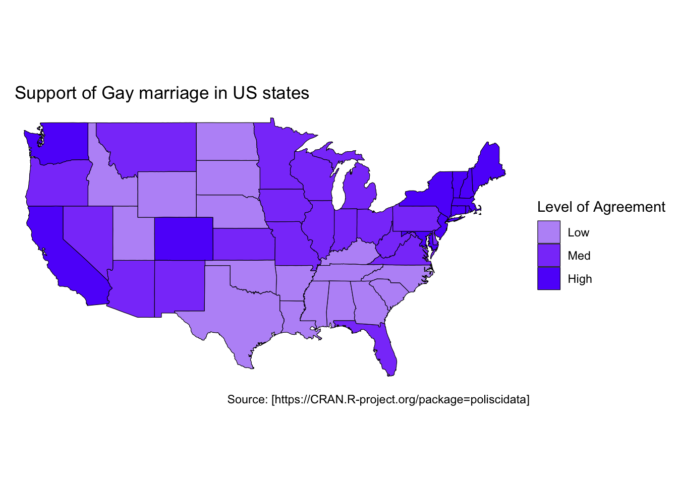
And again here is a interactive version using leaflet.
Figure 4: support of gay marriage in us states. We can see that most states in the south have low support, while states on the east and west coasts and rust belt have higher support. Source: [https://CRAN.R-project.org/package=poliscidata]